
If you have ever watched an org chart get redrawn, you know the ritual. The boxes go up on a screen. People get dragged from one branch to another, a new box appears, two old ones merge, a dotted line gets argued over for twenty minutes. Everyone nods at the cleaner shape. Then the company goes back to work exactly as before, routing around the new lines the way water routes around a rock, and six months later nobody can say what the reorganization actually changed.
The org chart is a map. And the reason it so often moves nothing is that it is usually a map of the wrong city. And a great deal of the time, leaders are reading a map of the wrong city.
Trees and roundabouts
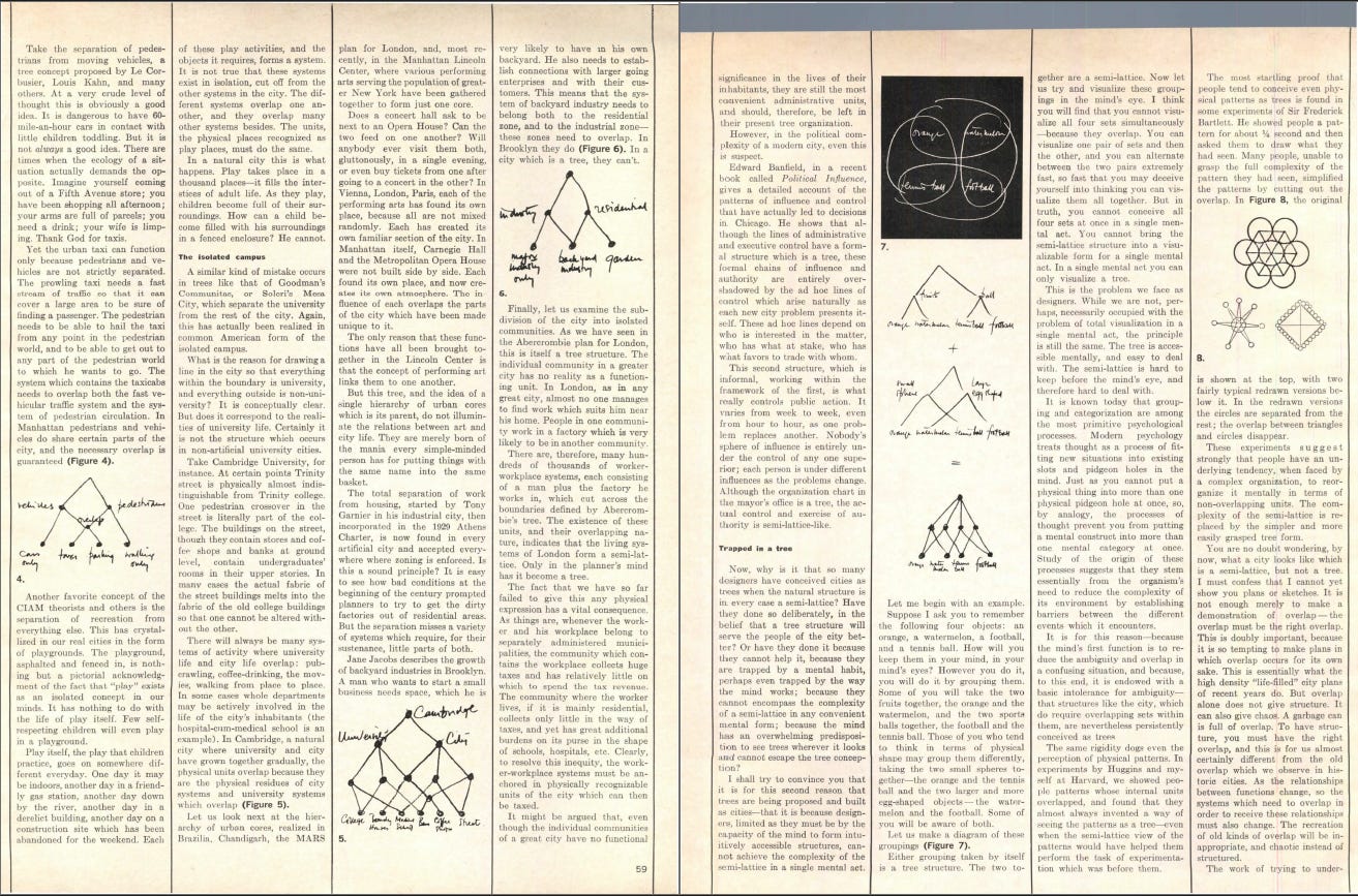
In 1965 the architect Christopher Alexander wrote an essay with a stubborn little title, “A City is Not a Tree.” A tree, in his sense, is not the green thing in the yard. It is a way of organizing where every part belongs to exactly one larger part. Your team rolls up into a department, the department into a division, the division into the company. One parent each, no overlap, clean branches all the way down. It is easy to draw and easy to hold in your mind, which is exactly why we reach for it.
A city that grew on its own does not work that way. Alexander called the real shape a semilattice, which sounds technical but means something plain: things belong to many groups at once, and those groups cut across each other. The corner café belongs to the morning commuters, the after-school kids, and the old men who play cards there at noon, and none of those groups contains the others. They overlap. That overlap is the life of the place.

A company is a semilattice wearing a tree costume. The chart says one person reports to one boss. The actual day says that person sits in three working groups at the same time, gets the real answer from someone four boxes away, and solves problems by crossing the very branches the chart drew as walls. Leadership keeps editing the tree. Everyone else lives in the semilattice.
Takeaway: when you redraw the chart, you are editing the tree. The company keeps living in the semilattice. If the redraw does not account for the overlaps people actually work through, you have rearranged a picture, not the place.
The wrong city for the map
Cities come in shapes. Manhattan is a grid. You can give directions there in pure arithmetic: go three blocks north, two blocks east, you have arrived. The grid is legible from the street because the street tells you where you are. London and Paris are radial, built outward in rings and spokes from old centers, with streets that bend and rename themselves and meet at angles no one planned. You cannot navigate Paris by counting blocks. You navigate it by knowing the neighborhoods.
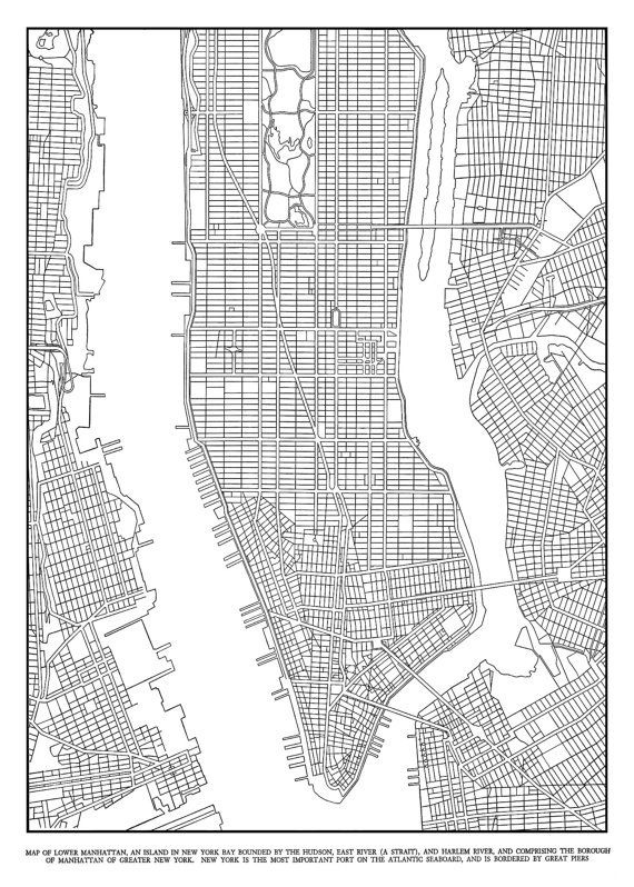
The mistake I watch leaders make is laying a Manhattan grid over a London city. They install a clean, rectangular chart, crisp reporting lines, every function in its lane, onto a company that actually grew in rings and spokes around a few founding relationships. The chart looks orderly. The work keeps flowing along the old radial paths, the ones that follow trust and history rather than the boxes. So you get a company that behaves one way and reports another, and the people running it stare at the gap and assume someone is being difficult.
The reverse happens just as often. A genuinely grid-like operation, repeatable, modular, where any unit could swap for another, gets run as if it were a precious radial web that must route through the founder. That company stalls every time the center is busy.
A chart does no harm on its own. The damage comes from reading it as the map of a city it does not describe.
Reading is not deciding
A sharp reader stops me here. If the city’s shape is the whole problem, why not just use Google Maps? It does not care whether you are in Manhattan or Paris. It routes you door to door through either one, and the bends and spokes that fooled you on the street mean nothing to it. So why fuss over grid versus radial at all, when the tool that solves navigation already shipped?
The objection is right, and it is right in a way that helps. Google Maps does not work by deciding what shape Paris ought to be and forcing the streets to comply. It reads the streets that are actually there, every one-way and dead end and bend, and then it watches where the cars actually move. The thin red lines it draws over the roads are made of real movement, real people choosing real routes in real time.
Planners have a name for tracks like those. Walk across any campus and you will find dirt paths worn into the grass, cutting diagonally across the lawns the architects laid out. They are called desire lines, because they mark where people actually wanted to walk, as opposed to where the paved path told them to. The red lines on Google Maps are desire lines captured live and never frozen. The tool is the opposite of the planner with the ruler. It reads the territory and keeps reading it, the way the map keeps reading the traffic, rather than drawing one clean picture and laminating it. The objection points straight at the cure.
Notice, though, where Google Maps stops. What it shows you is rich enough to point at where the next hospital should go. You can see which neighborhoods sit far from any clinic, where the roads choke every morning, which bridge carries more than it was built for. The answer is sitting inside the map for anyone who reads it carefully. What the map will not do is make the call. It hands you everything you need to work out the decision and then leaves the deciding to you. The reading it does for free. The choosing it leaves on your desk.
That gap, between what the map shows and what someone has to commit to, is where two different jobs come apart. The org chart pretends to do both. It poses as the live picture of how work moves and who to call, and it poses as the plan for where the structure should go next. It does both poorly because they are different acts. Reading the city should be live and built from the bottom, drawn from how the work actually flows, the way Google Maps is drawn from where the cars actually drive. Deciding is what you do on top of that reading. You see where the work piles up and where the single bridge strains, and then you choose: lift a function off the overloaded center, open a second route. The map can lay the strain in front of you. Only a person makes the cut.
Takeaway: keep the reading and the deciding separate in your own head. The reading shows how the work moves today, drawn from the bottom, from the worn paths, and never frozen. The deciding commits to where the work should move tomorrow. A good map can point hard at the answer. It will never make the cut for you. Most reorganizations fail because the decision gets made while the reading underneath it is pure fiction, so someone commits to a city nobody actually lives in.
Reading the city you are in
Kevin Lynch spent the late 1950s asking ordinary people to draw their cities from memory. Some cities came back as clear, confident maps. Others came back as fog. He called the difference legibility, the ease with which a place assembles into a coherent picture in your head. A legible city is one you can hold whole. An illegible one keeps you guessing about where you stand.
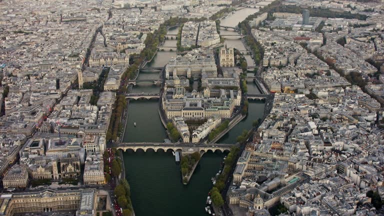
There is a trap hidden in that. From the street, a radial city can feel like a grid. You walk a few blocks of Paris that happen to run straight and you think, this is orderly, I understand this place. You only learn the truth when you try to get somewhere far and the streets fan out and betray the assumption. Standing inside a company, in your own function, talking to the same six people every day, the whole thing feels like a tidy grid. Everyone has a box. The lines connect. It looks legible.
Legibility from one corner is not legibility of the city. To actually see the shape, to know where every part stands in relation to every other part, you have to climb. You have to rise far enough that the radial truth of how work really moves becomes visible all at once. That climb is the rare skill. Most people never gain the height, and the ones who do often gained it by being promoted out of the streets, which means they now read the city from an altitude where the most important thing has gone faint.
Takeaway: the feeling that your org is simple and well-ordered is usually a report from street level. Test it by asking how a real decision actually traveled last month. The route will almost never match the chart.
The worn paths
Every company is full of desire lines. “Don’t file the ticket, just ask Yohannes, he has been here eleven years and knows where everything lives.” That shortcut is a path worn into the company by years of people needing to get somewhere the official route did not take them. A good reorganization studies those tracks and paves them, because they show you where the work genuinely wants to go. A bad one fences them off, insists everyone use the paved walkway, and then wonders why the same distance now takes three times as long.
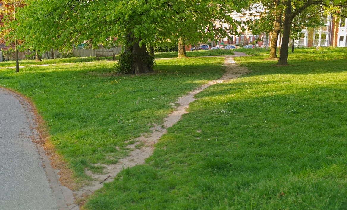
When a company depends on a Yohannes, leadership tends to react two ways, both wrong. Some treat the dependency as a flaw to engineer out. Others ignore it because it works. The useful move is to read it. That worn path is telling you the chart routed the work incorrectly. Yohannes is the real design, the one the city built while no one was drawing, and the chart simply failed to write it down.
The overloaded center
A radial city routes everything through its hub. That works beautifully when traffic is light. The founder knows where every body is buried, the one veteran VP can untangle any knot, and from the street this looks like strong leadership. From above it looks like a roundabout at rush hour. Every route passes through the same circle, and the day that circle jams, the whole city stops at once, with no alternate path, because the design never built one.

This is the quiet cost of a radial company that refuses to grow grid-like seams where it should. The center feels indispensable, and indispensability feels like strength, right up until it becomes the single place where everything seizes.
Altitude is the cure and the disease
Zooming out is the rare skill. That much is true, and I have leaned on it throughout. I want to push on the other side of it, because the climb that lets you finally see the city is the same climb that tempts you to ruin it.
The anthropologist James Scott wrote a book called Seeing Like a State about exactly this. His argument is that grids, straight roads, numbered plots, uniform everything, get imposed not because they serve the people on the ground but because they read cleanly from above. A forest planted in neat rows is easy for an administrator to count and tax. It also turns out to be a worse forest, because the messy original was doing a hundred quiet things the tidy version cannot. The view from the tower rewards whatever is legible to the tower, and punishes whatever is merely alive.
So altitude does two things at once. It lets you see the radial truth of your company for the first time. And it whispers that you should clean it up, straighten the bending streets, erase the worn paths, file Yohannes under a proper title with a proper process, because from up there the geometry is all you can see and the human web has faded from view. The leaders who do real damage are usually not the ones who never climbed. They are the ones who climbed, saw a living radial city, and could not resist redrawing it as a grid because a grid is what fits on a slide.
This is also where reading and deciding come apart in practice. Google Maps reads from above without flattening what it sees. It holds the whole city in view, respects every bend, and will even let you work out where the next bridge belongs. What it never does is decide to build it. That last step, the commitment, stays human. The skill is gaining height while refusing the reflex to tidy, seeing the whole and leaving most of it as messy as it needs to be.
I find it useful to keep a rough relationship in mind, less an equation than a way of pointing at what drives the strain:
Friction ∝ Gap / Vantage
You read this as: the effort it takes to get anything done in a company rises with the gap between the chart people are handed and the real routes they travel, and it falls the more genuine height leadership has to actually see that gap. A leader perched high with an honest view, who closes the distance between the map and the streets, runs a low-friction city. A leader who either cannot climb, or who climbs and then flattens what they see into a prettier picture, widens the gap and pays for it in every meeting that should have taken ten minutes and took three weeks.
Takeaway: before you redraw the chart, find out which city you are in. A radial company managed as a grid will route around you. A grid company managed as a radial will choke at its center. Climb high enough to see the structure you already have, and be honest about what you find up there, before you touch the one on the slide.
The next time the slide deck comes out and the boxes start moving, listen for whether anyone in the room has actually seen the city. Usually no one has. They are each standing on a familiar corner, mistaking a few straight blocks for the whole of Paris.